
Increased client registrations by 21% by re-designing the website template for 1000+ veterinary practices across the UK, improving usability for pet owners and reducing workload for practice staff and our Content Team.
Role
Product Designer
I led the design from initial research and discovery, to ideation to final design delivery.
Timeline
May 2024 - Jan 2025
Company
IVC Evidensia
Outcome
Increased registrations by 21%
Team
Acquisitions
Scale
1000+ practices
Measurement Method
20-site pilot test
Context
IVC Evidensia is Europe’s largest veterinary company with over 1,200 practices across 10 countries resulting in being responsible for the health and wellbeing of millions of animals. The UK is their largest market with 1000+ practices across the nation.
Each veterinary practice has their own website built using a choice of 4 templates. Each template comes with a range of components and flexibility regarding colours, fonts, etc. These templates were designed by the developers during IVC's earlier years and over the years been built on again and again.
The Problem
The templates for IVC’s 1000+ veterinary practice websites had become cluttered with tonnes of irrelevant information which made it difficult for pet owners to get the care they needed and caused unnecessary manual work for the practice staff.
There were 2 primary problems with the old templates:
Content Overload
The practice staff had a strong say about what was added to their website (I know, this seems fair).
However this resulted in everything being added, from Pet of the Month awards (that hadn’t been updated since 2019) to a page dedicated to the recently retired receptionist. These are great sentiments, but this just created noise that got in the way of existing and new clients looking to get their pet the care they need.
These new pages always “had to be at the top" of the navigation, meaning the Content Team had no choice but to add more items in the navigation bar, creating an endless list of links and dropdowns, distracting clients and getting in the way of the main job that they came here to do.
Outdated Goals
The primary CTAs on the existing templates weren’t aligned with the new objective of the business.
The new goal was trying to reduce the unnecessary workload for the practice staff so they had more time to do the jobs that were more impactful. The idea was to allow clients to self-serve wherever possible, freeing up time for both clients and practice staff.
We were also trying to get more new pet owners to join our practices. The current sites were built to drive bookings with existing clients, whilst every other job was a secondary thought left for the pet owner to find on the site.
Goals
Some goals were given by the leadership team, others were decided by the team and some were more personal to me, but still valid in my opinion.
Scalable
Must work for vet practices of all sizes and specialities.
Registrations
Increase net new registrations of pet owners.
Phone calls
Decrease phone calls to practice.
Time-saving
Save time for Content Team by reducing pages.
Stability
All other metrics remain stable.
Satisfaction
Practices are happy with their branding usage.
Discovery
I did various types of initial research to help paint the full picture of the problem I was trying to solve. These include:
User Journey Mapping - Mapping out the existing user flows from all entry points (social, in-practice, direct to website, etc) to see the full journey and identify any flaws and areas for improvement.
Market Research - Looking at the current state of the market, relevant metrics (number of new pet owners, dog/cat population), the market share of practices owned by IVC compared to our competitors, determining if the IVC is "down" or if it's a market-wide issue.
Google Analytics - Using the data from our 1000+ practices I was able to look at a vast amount of data to see what pages our pet owners were visiting most and what jobs they were looking to get done.
Competitor Analysis - Analysing the websites of direct and indirect competitors to see how their websites differ and what they do well. The common problem with this however is that most other markets/direct competitors weren't set up like IVC was, from a scale or a brand perspective.
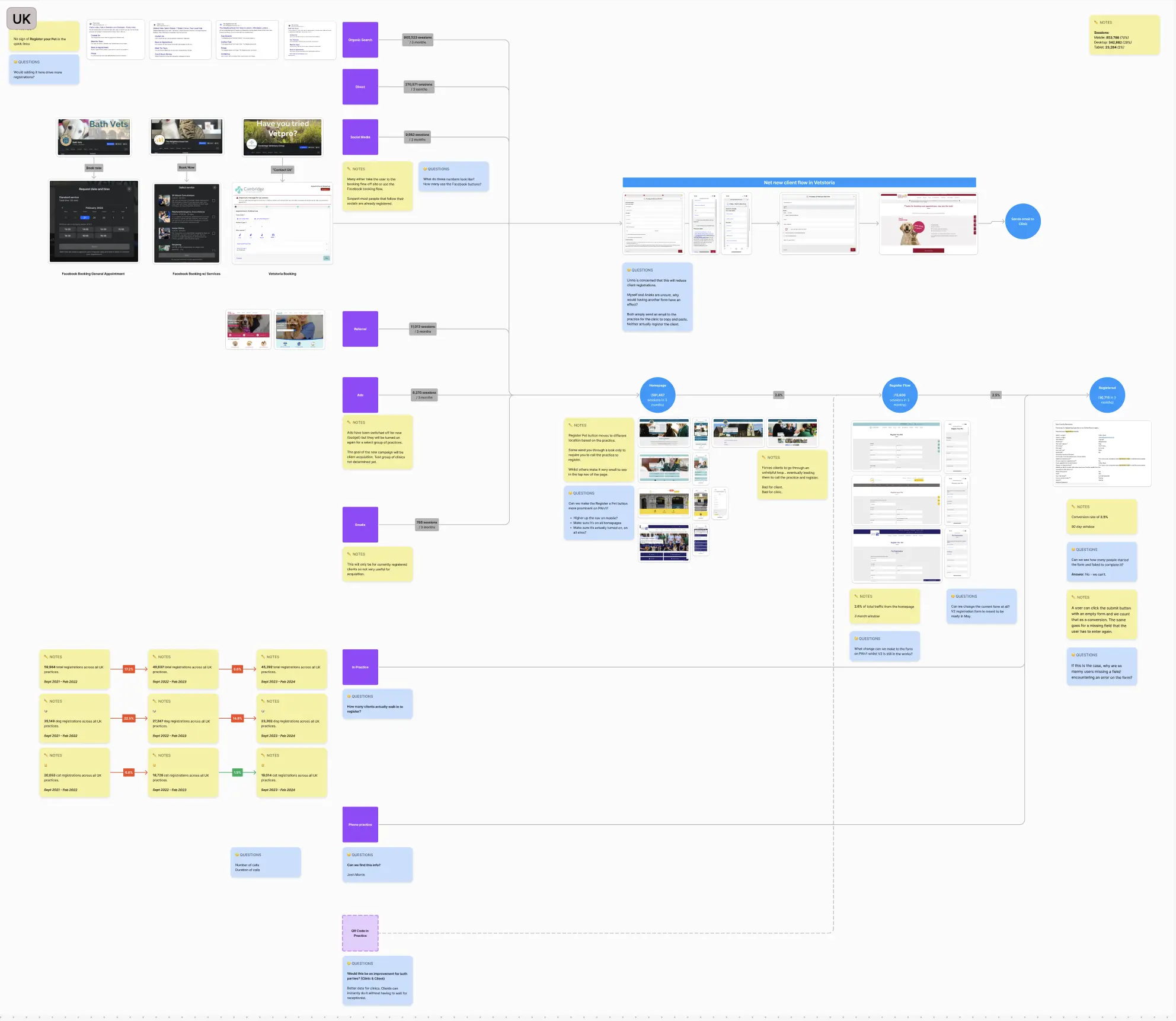
User flow mapping
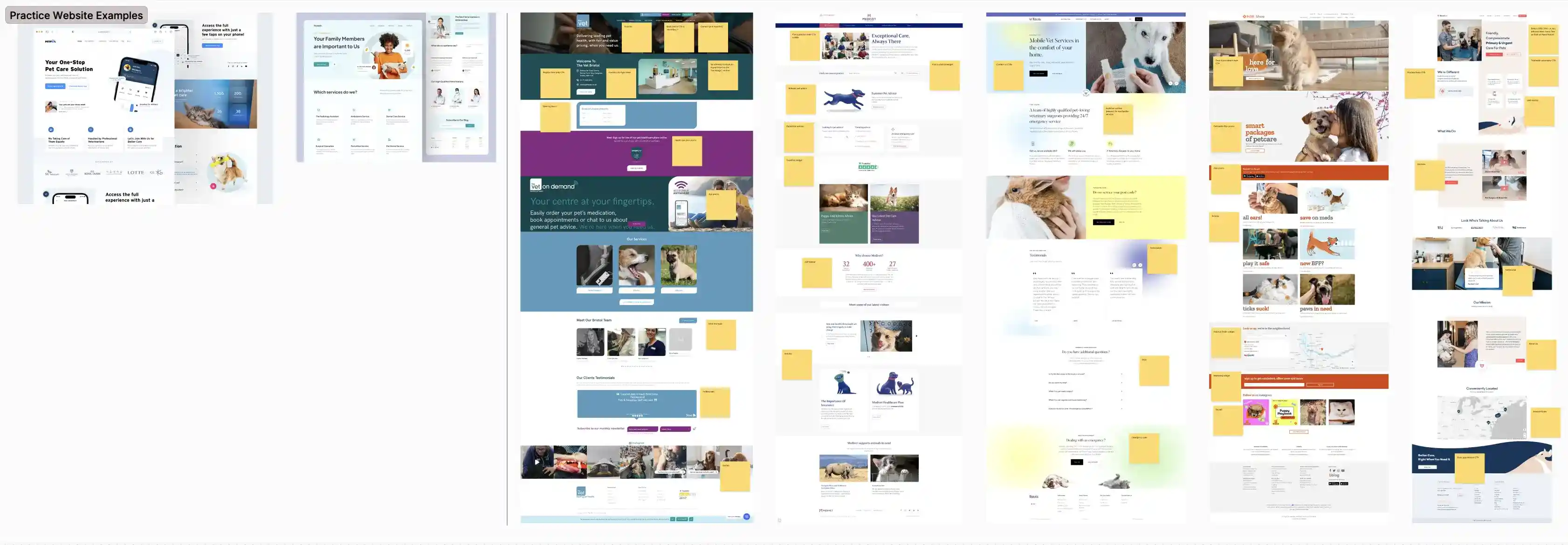
Competitor analysis
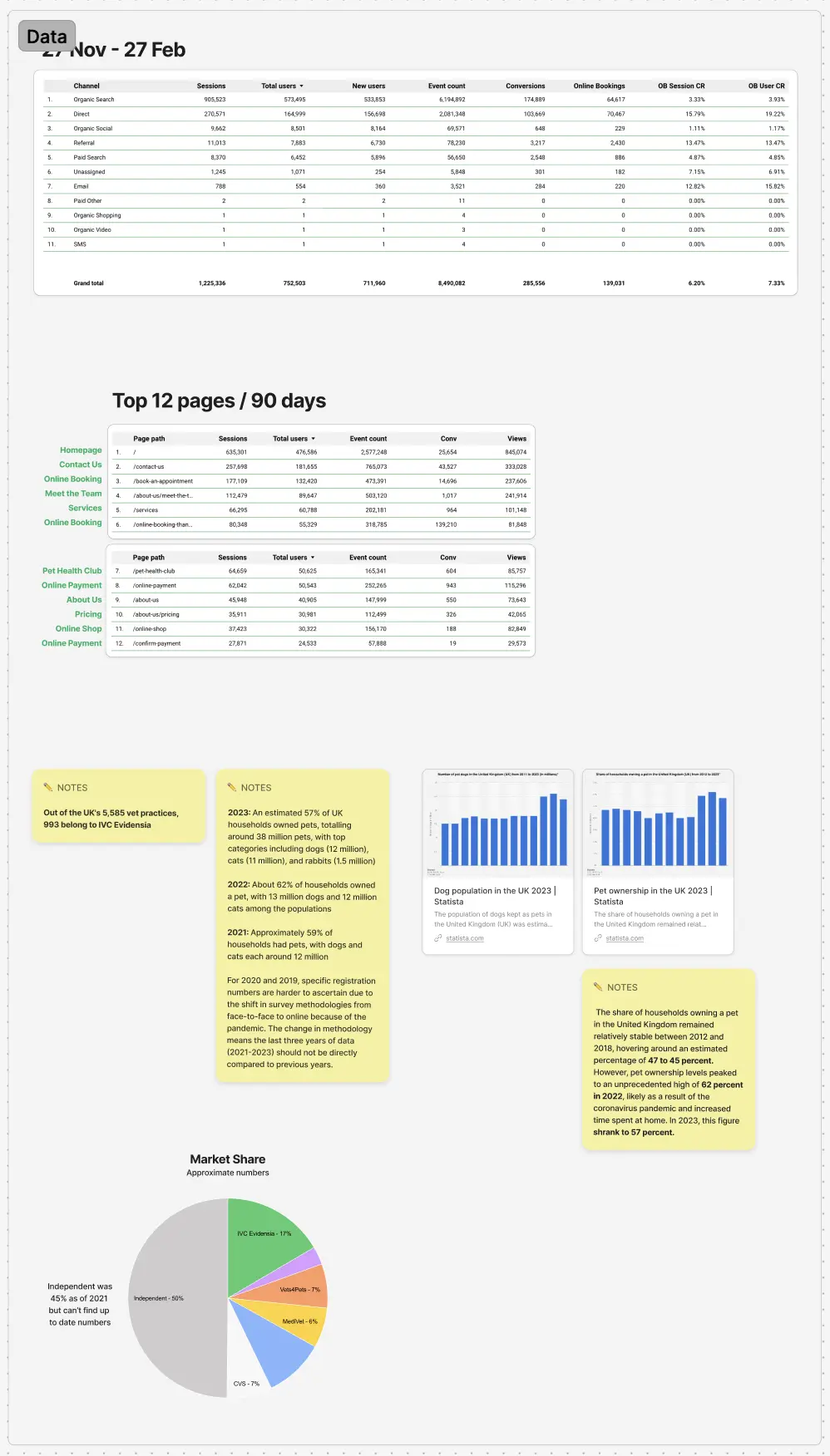
Google Analytics data
Discovery findings
The analytical discovery found that the majority of pet owners only wanted to perform a handful of jobs on a select few pages. The other pages were essentially unused.
This meant I should prioritise these pages in the navigation and around the site, to allow pet owners to perform these tasks with more ease.

Team Collaboration
Product Manager: Worked together to determine OKRs, success metrics and what each sprint would involve.
Engineering: Helped decide how complex forms and designs would be feasible to build.
Marketing: Made the risk of removing lots of content clear and suggested ways we could reduce the SEO hit.
Ideation
Ideation started with mobile-first (our largest traffic funnel) wireframes with various combinations of layouts, component types, order and hierarchy. My thinking was to create an "easy access" homepage with all tasks to be quickly accessible at the top and all necessary information to be a simple click away with the use of anchor links.


Design
Reducing navigation complexity without removing essential functionality
The old navigation was full of links that were competing for priority and attention, many of which led to pages that pet owners didn't care about (when looking at the data above).
I prioritised the information and tasks I knew pet owners wanted to see and organised the similar links into easy to understand categories to reduce the number of top level items. This resulted in a much simpler and "quieter" navigation, only drawing attention to useful information and the two main CTAs that most pet owners needed.
I initially tried a two-tier navigation to separate some of the jobs to be done flows and information about the practice but this ended up with a much larger navigation than before without making much of a difference to overwhelming amount of links shown to the user so I decided it wasn't a suitable solution.

JTBD action tiles
Bringing the main JTBD to the forefront of the homepage into eye-catching tiles allows the majority of clients to quickly achieve their goal without having to think about where they need to go.
One goal was to reduce phone calls, so I did consider removing the Contact tile entirely to help push those self-serve user flows but there will always be a need to contact the practice for some niche reason so I kept it but put it at the end.

Introducing smart user flows with conditional logic
The old user flows consisted of one very long, single page "dumb" form with no validation and didn't ask the correct information required for the practices to register a new pet.
I found a study that discovered that clients have no issue with completing a long form if they saw the value in the end result, and there is nothing more important to an owner than their pet's health. I came to a similar conclusion myself after conducting some competitor analysis, some forms were 15+ steps long for dog food brands. I decided to use this insight to make sure we asked all the information the practice needed at the right time.
There were a number of questions the original forms failed to ask:
If the pet is insured, microchipped and neutered
If the pet was previously registered at another vet practice.
These questions are crucial to the registration flow because the practice must know the information before the pet is registered. This meant previously the practice had to call the client to ask this information, wasting their precious time.
I also added conditional logic and enforced validation throughout the form. One example was the species and breed selector. Previously this was a free text field which was a nightmare for data input and validation. I added a dropdown field that showed a pre-defined list of breeds relevant the species selected above.


Personalised questions with logic from previous answers.

Questions that weren't previously asked, forcing staff to call the client, wasting their time.
Get Care
Condensing the multiple ways to receive veterinary care into one Get Care button leads to a much simpler way for clients to get their pet’s care. A worried pet owner might not know what type of appointment their pet needs, but we do, so we do the thinking for them.

Get Care dropdown showing all care types.

Get Care page with an explainer for each category.
Design System
The existing templates were built without any designs so for this new template I created a component library from scratch to help development run more smoothly and to allow for other designers to ideate and design faster and more consistently for future development.
I also curated a set of colours and fonts available for the practice to choose from to fit their branding. I wanted to make sure the practices felt they had some freedom in this area whilst not compromising the likes of accessibility and brand guides at the same time.

Snippet of the component library
Reflection
Communication
This was my most complex project to date so I learnt a lot about UX and design but also about people, communication and collaboration. Throughout this project, we had bi-weekly meetings with all relevant parties run by our squad, and these sessions worked well. However, if I were to do this project again I would also have individual catch-ups with each team to allow them to ask more detailed questions and make sure their concerns were heard as there were scenarios where information was missed or assumed by various teams which led to issues and delays further down the line.
Tracking
One thing I have realised is that we made so many changes to the template and they did improve the metrics but because we put all the changes live at the same time, we couldn't determine which changes had the largest impact. This also means we can't see if a change actually had a negative effect.
Next time I would definitely push for a phased roll out so we could track what change had what effect. This would also make useful insight for other areas of the business going forward as well.